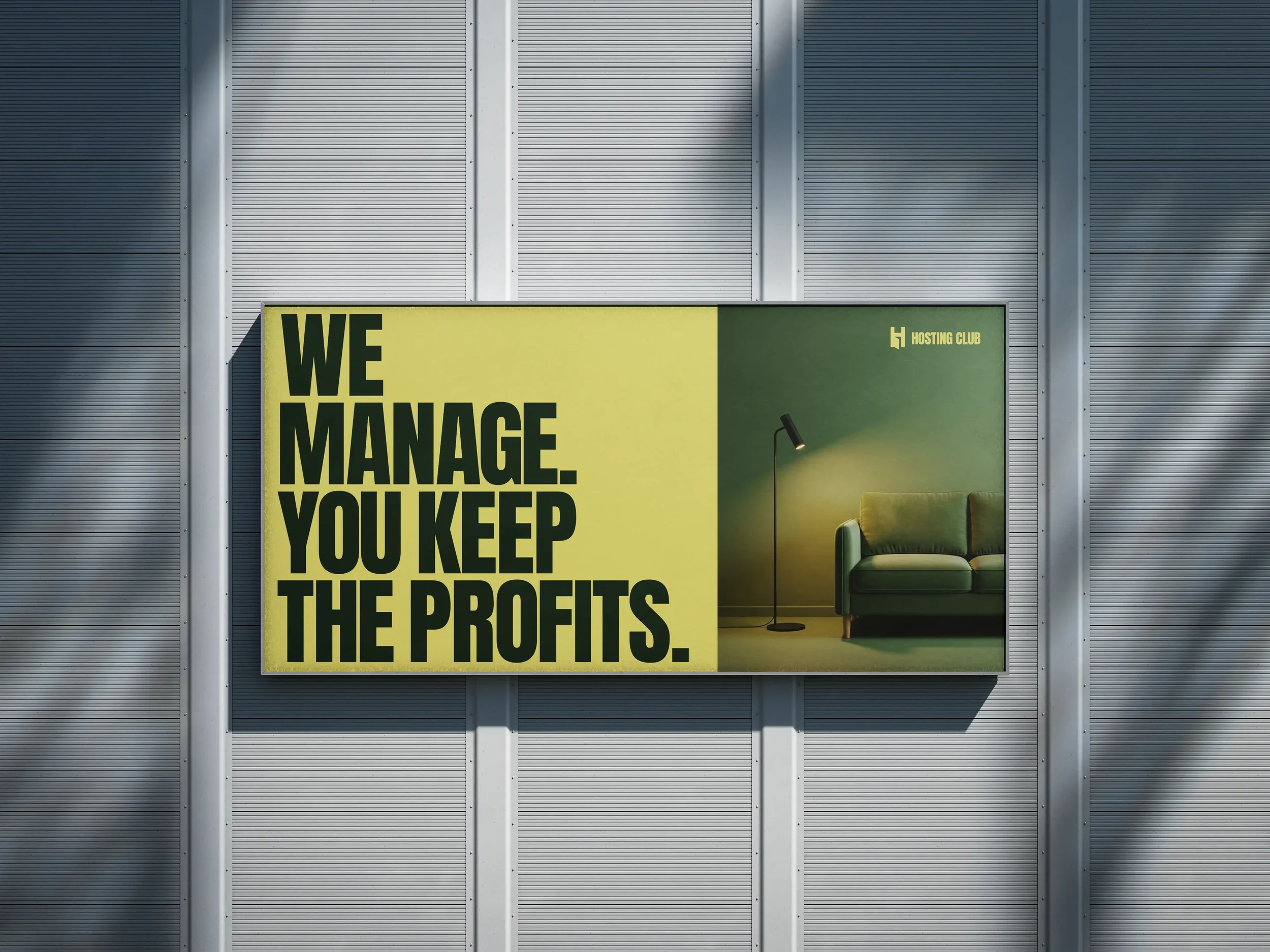
I’ve had the pleasure to rebrand one of the significant companies in the Property Management space in Europe. I’ve partnered up with a Copywriter and we developed a whole new Brand Direction for Hosting Club. I designed the Logo in a minimalistic approach where the H letter is an open door when looking from specific angles and thus symbolising Property Management. Along with a very bold condensed typeface & very vibrant colour palette (since the founders are Arabic origin) we immediately made a distinctive Art Direction where Hosting Club will be very different from what we currently have in a Real Estate Market, which is pretty minimal, architectural design styles. I’ve done the Art Direction for the Website Design, and created a complete Brand Book of Brand Assets & Guidelines.