Art Direction & Brand Identity Design for a Marketing, SEO, Google Ads & Web Design agency based in Vienna, Austria.
The Founder of the Agency reached out to me with a request of a complete rebrand of the agency - including new name, creative strategy, brand identity design & logo animation.
We dived into a deep brainstorming session & I came up with the name in a historical concept and thus positioned the agency completely different than its competitors. The name ‘‘Franz’’ symbolising history & culture in Austria - but also the Founder’s nickname (Franz) - blended history & digital space in the brand positioning of Franz Digital.
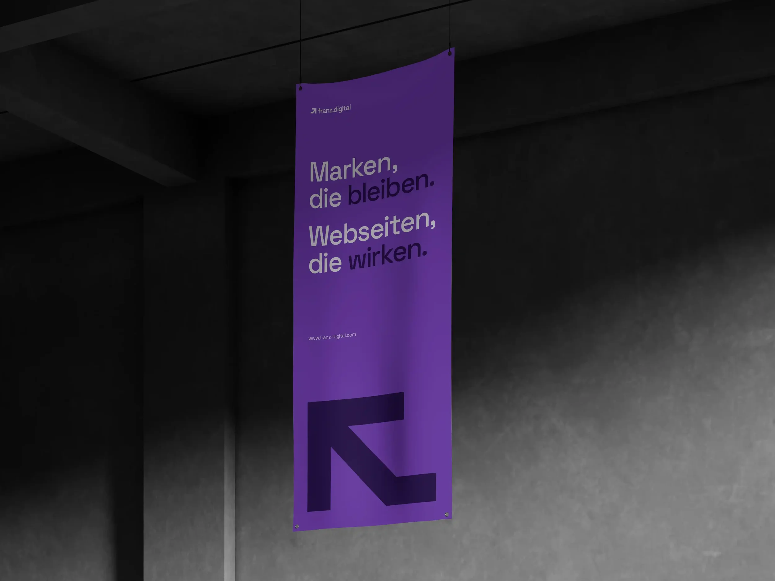
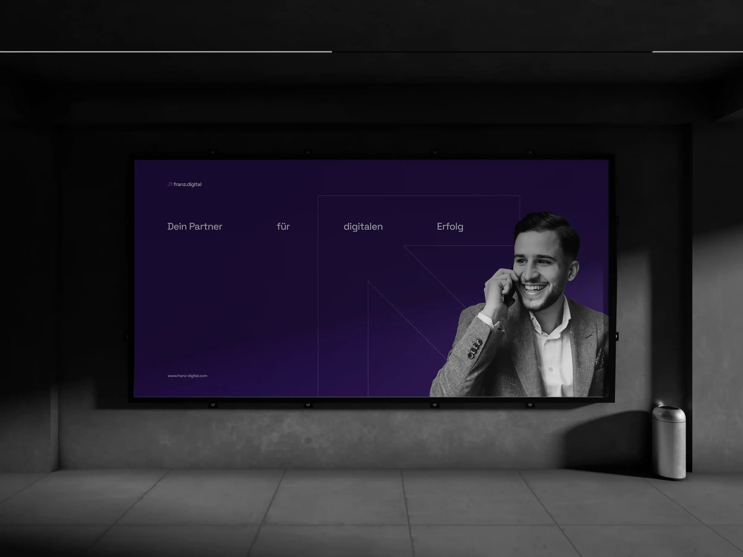
The ground line in the Logo design symbolises the particular starting point of anybody in need for a prospective & futuristic agency while still holding traditional & cultural values. The arrow on the other hand, symbolises the boosting momentum to space - once you start collaboration with Franz Digital.
Thus, the whole colour palette I developed, is associated with a cosmic feeling. Completing the story with Space Grotesk Typeface, I have completed a narrative about an agency which provides you with an unforgettable journey through space.
Art Direction, Brand Identity Design & Motion Design: Franz Digital