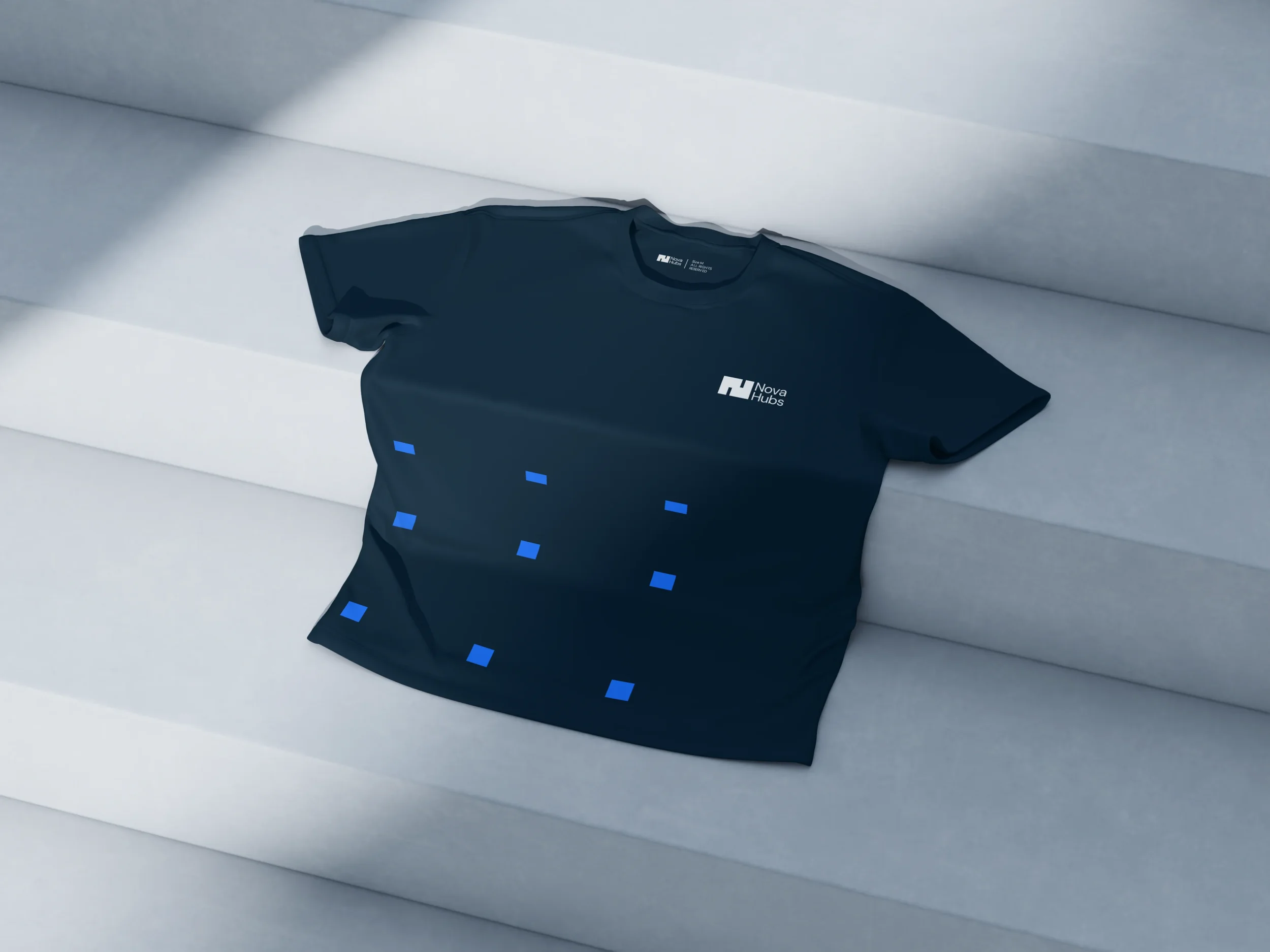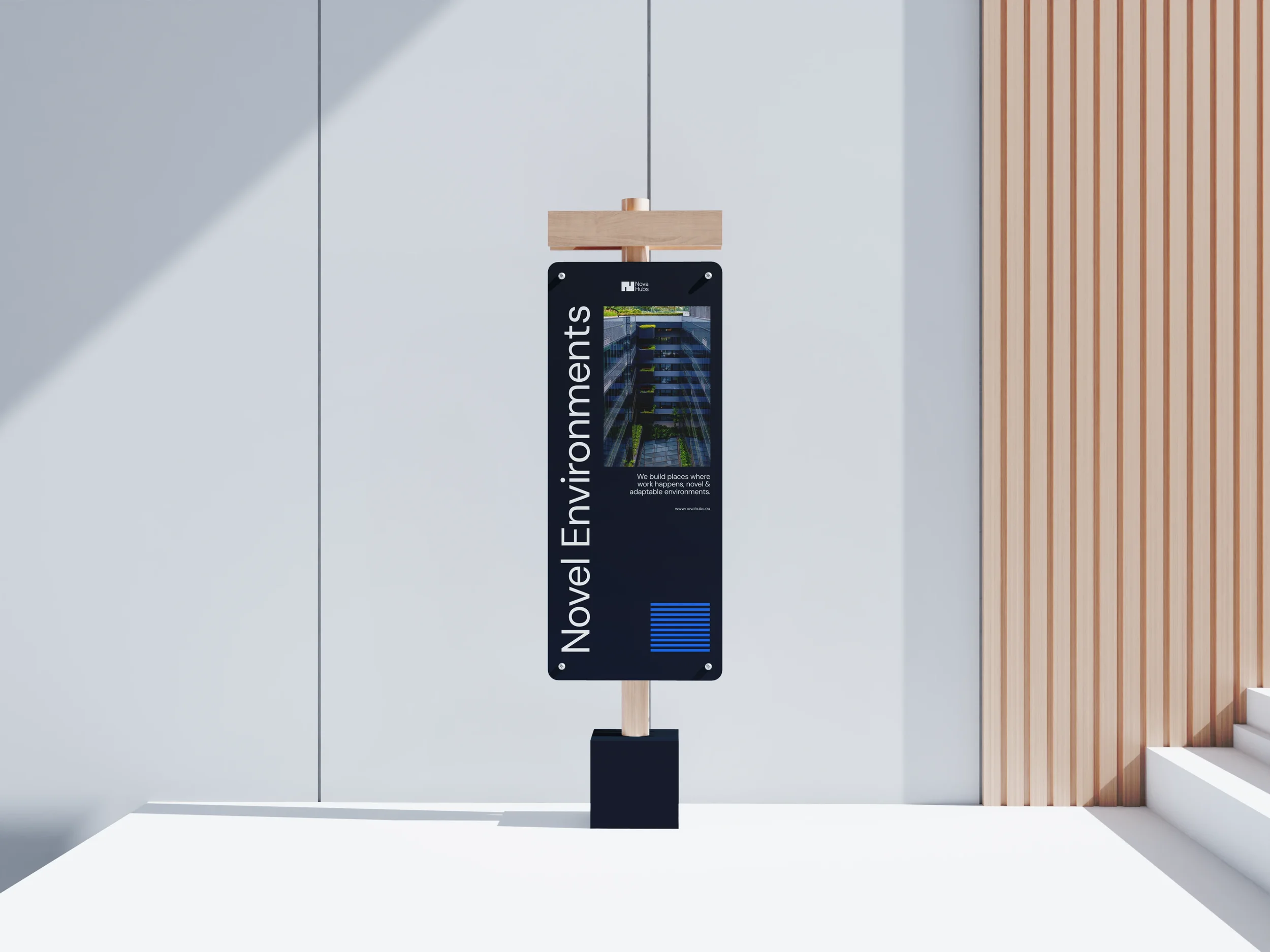
Art Direction & Brand Design: Nova Hubs
Art Direction & Brand Design: Nova Hubs
Art Direction & Brand Identity Design: Nova Hubs
Nova Hubs is a startup from Brussels, Belgium - which operates around Eastern & South Europe. They enable SME owners, entrepreneurs, and real-estate professionals to execute their ideas efficiently by providing the right physical spaces — practical, compliant, scalable, and future-ready.

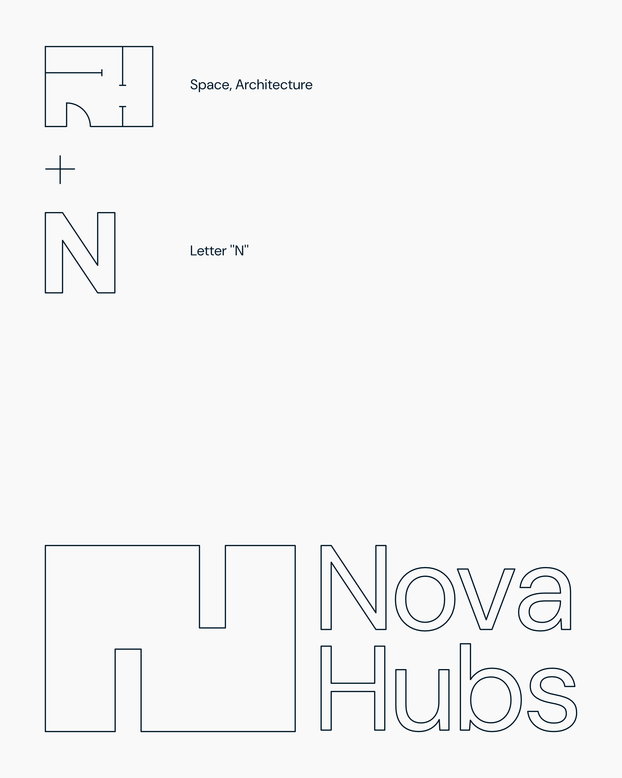
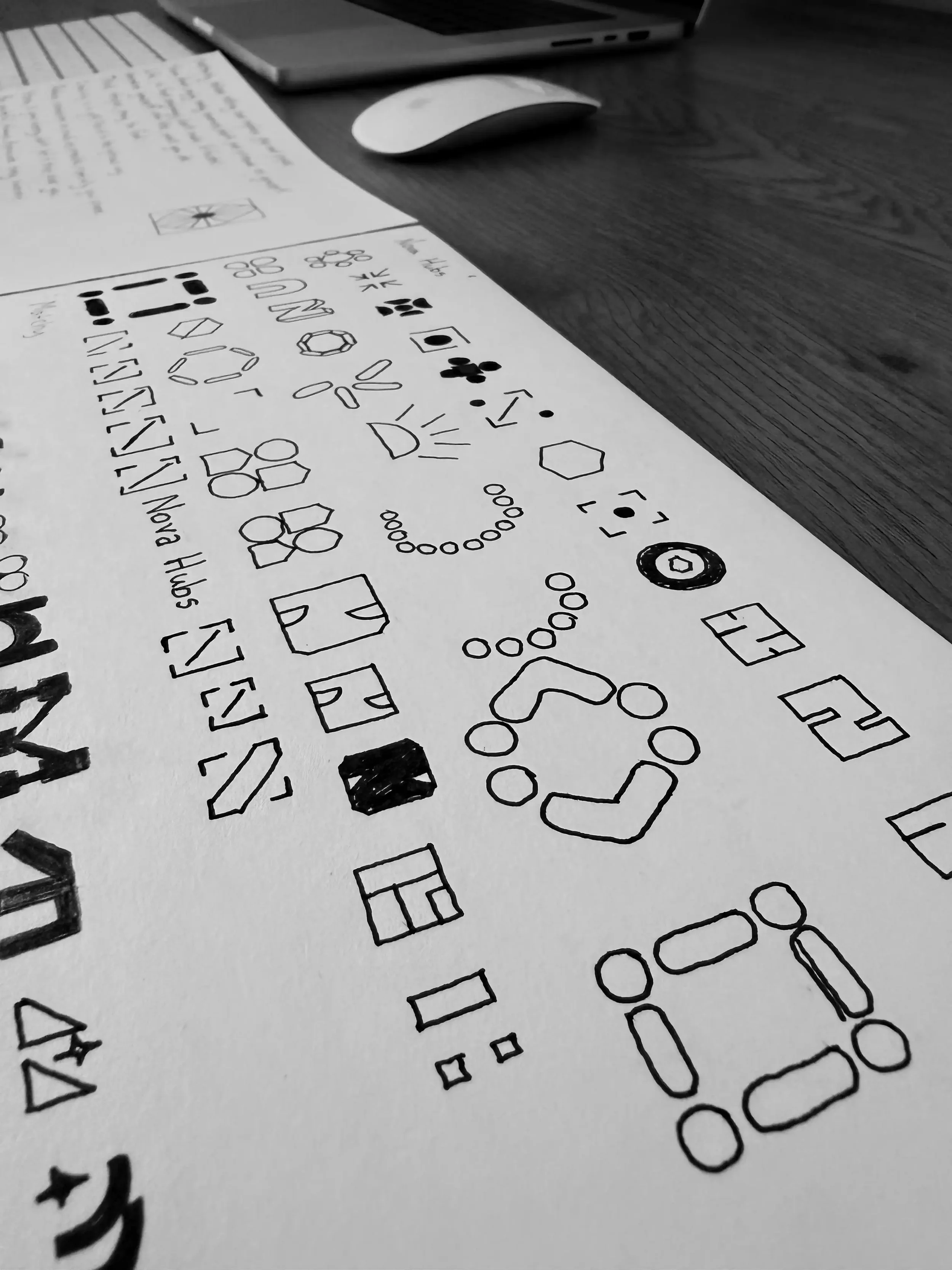
The logo represents a modular architectural floor plan draft in a simple geometric form. Consequently, the abstract floor plan is forming a bold letter ‘‘N’’ which stands for Nova. All together, with the rectangular form, reminds us visually on a hub, where spaces & people gather.
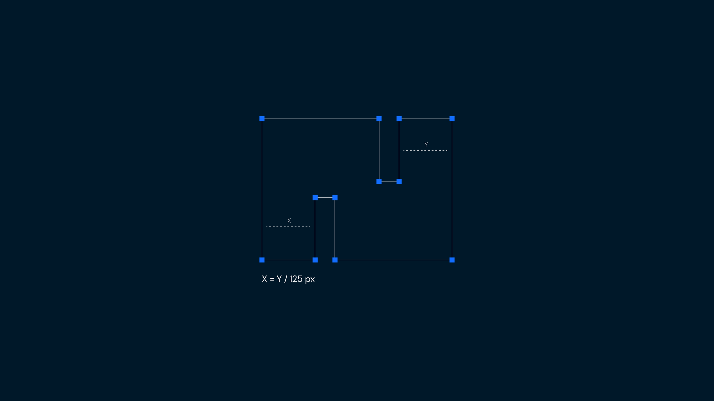
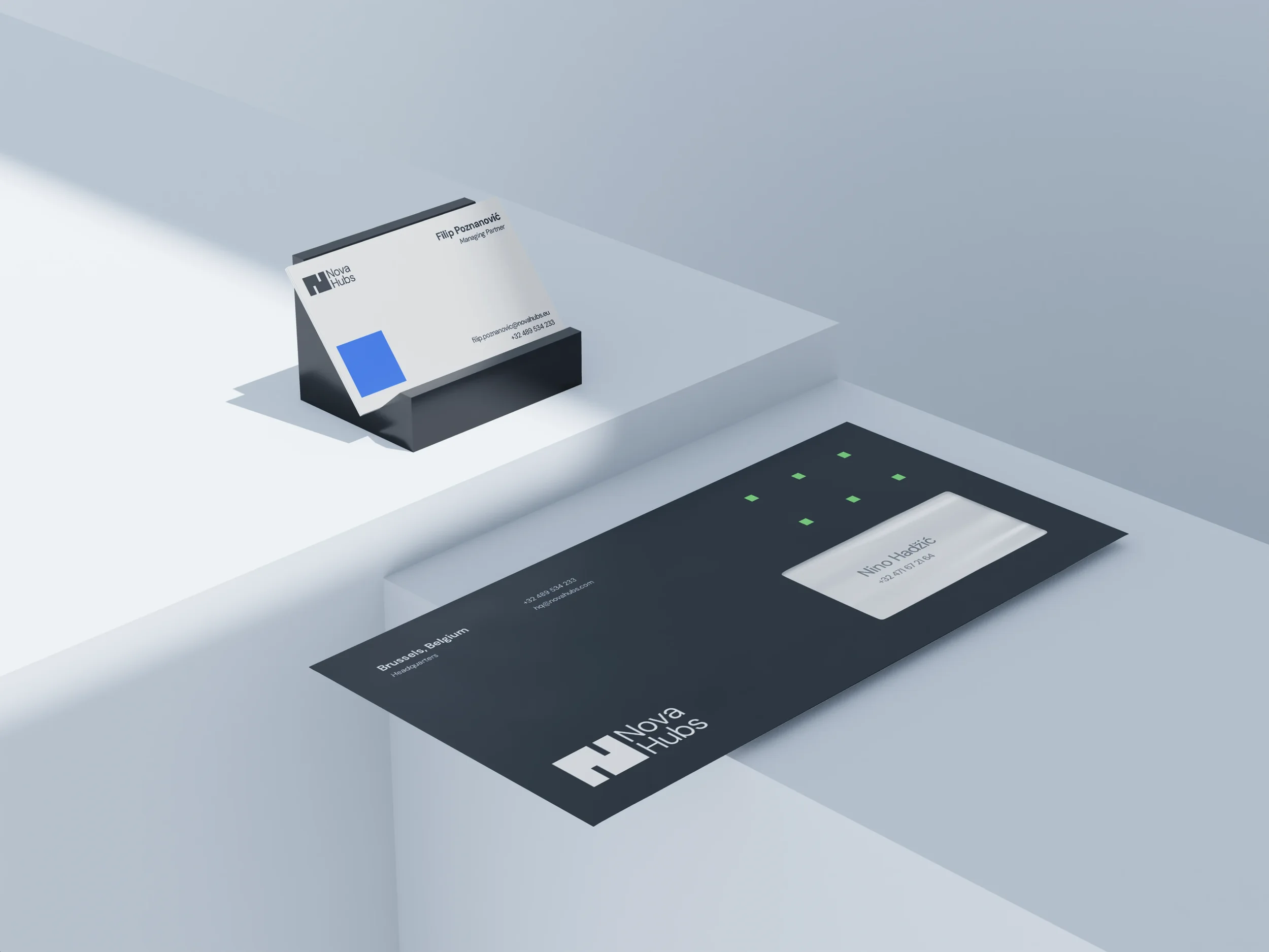
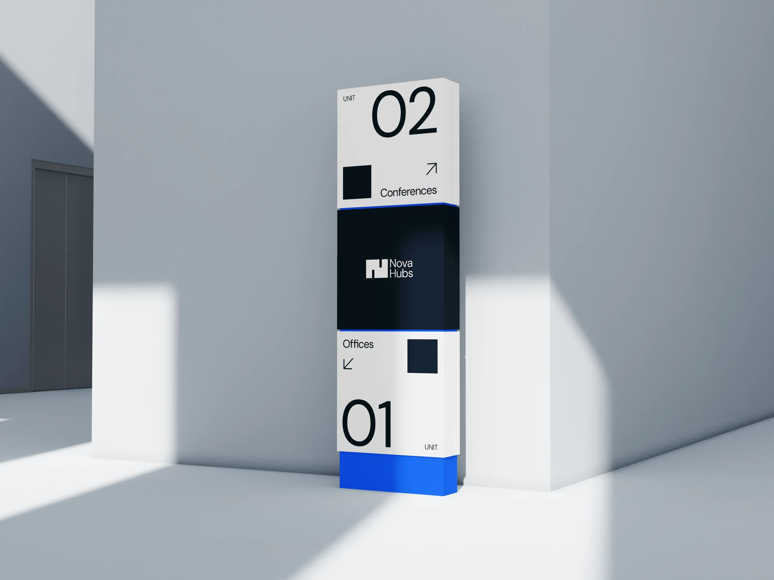
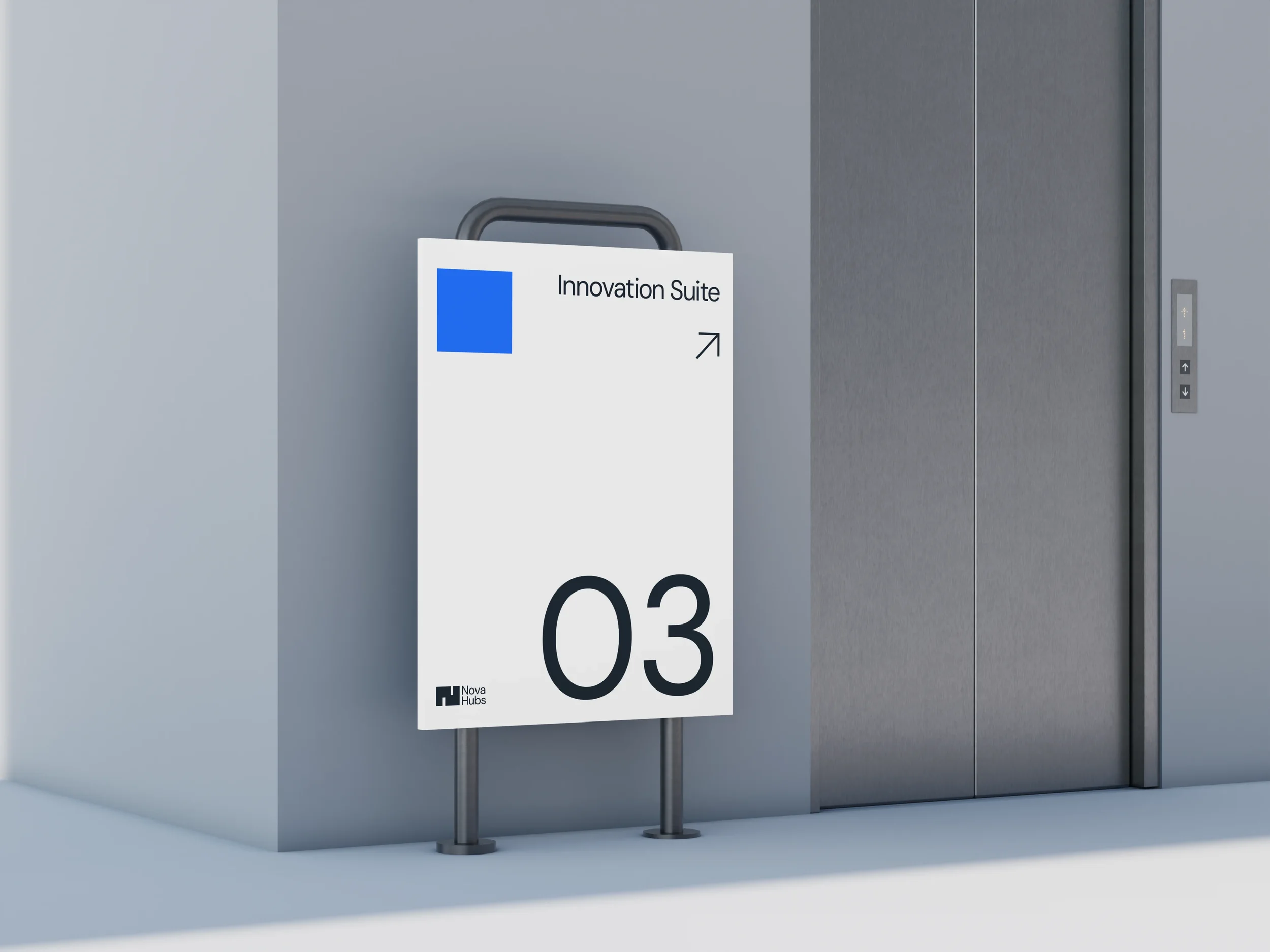
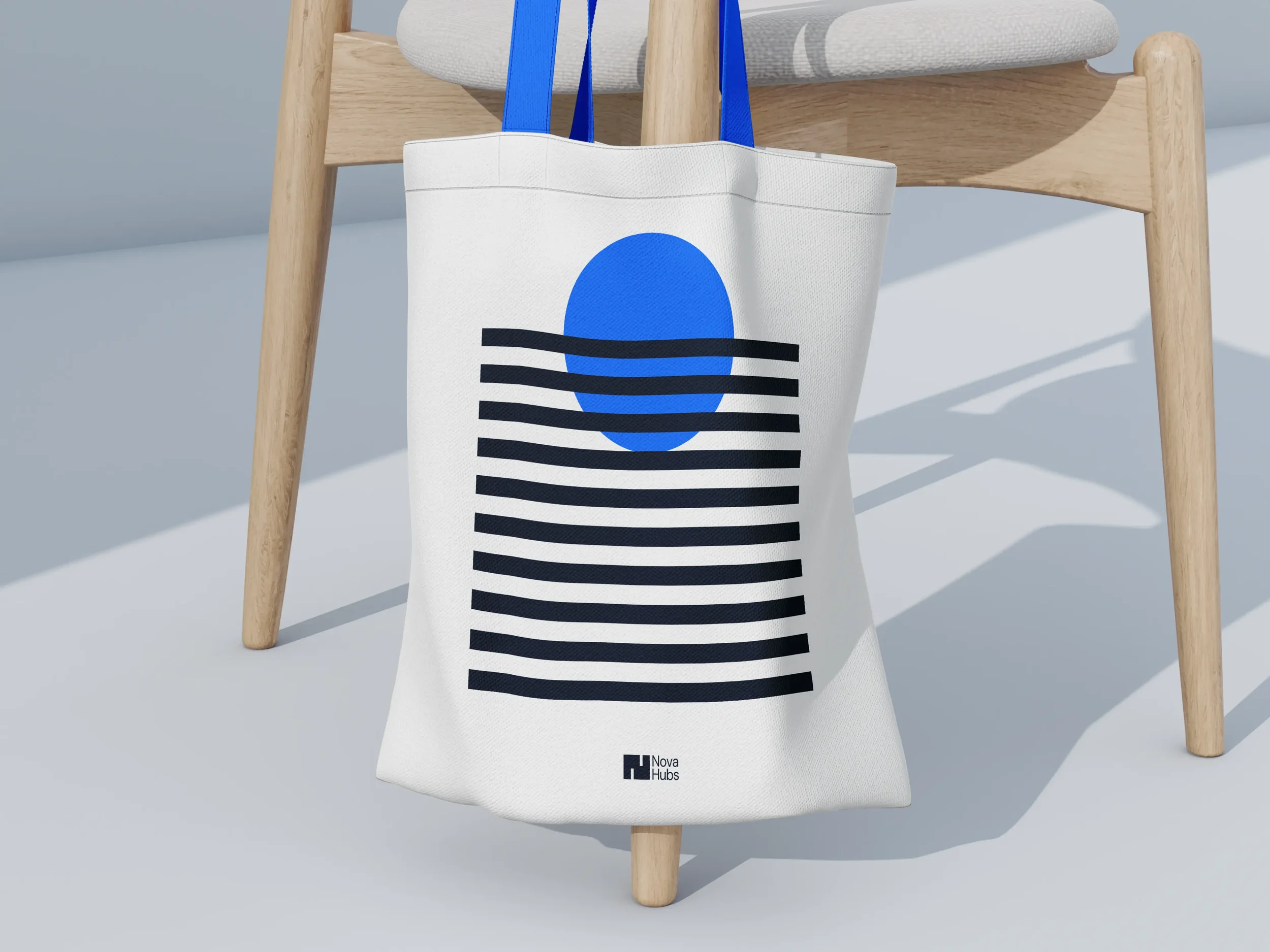
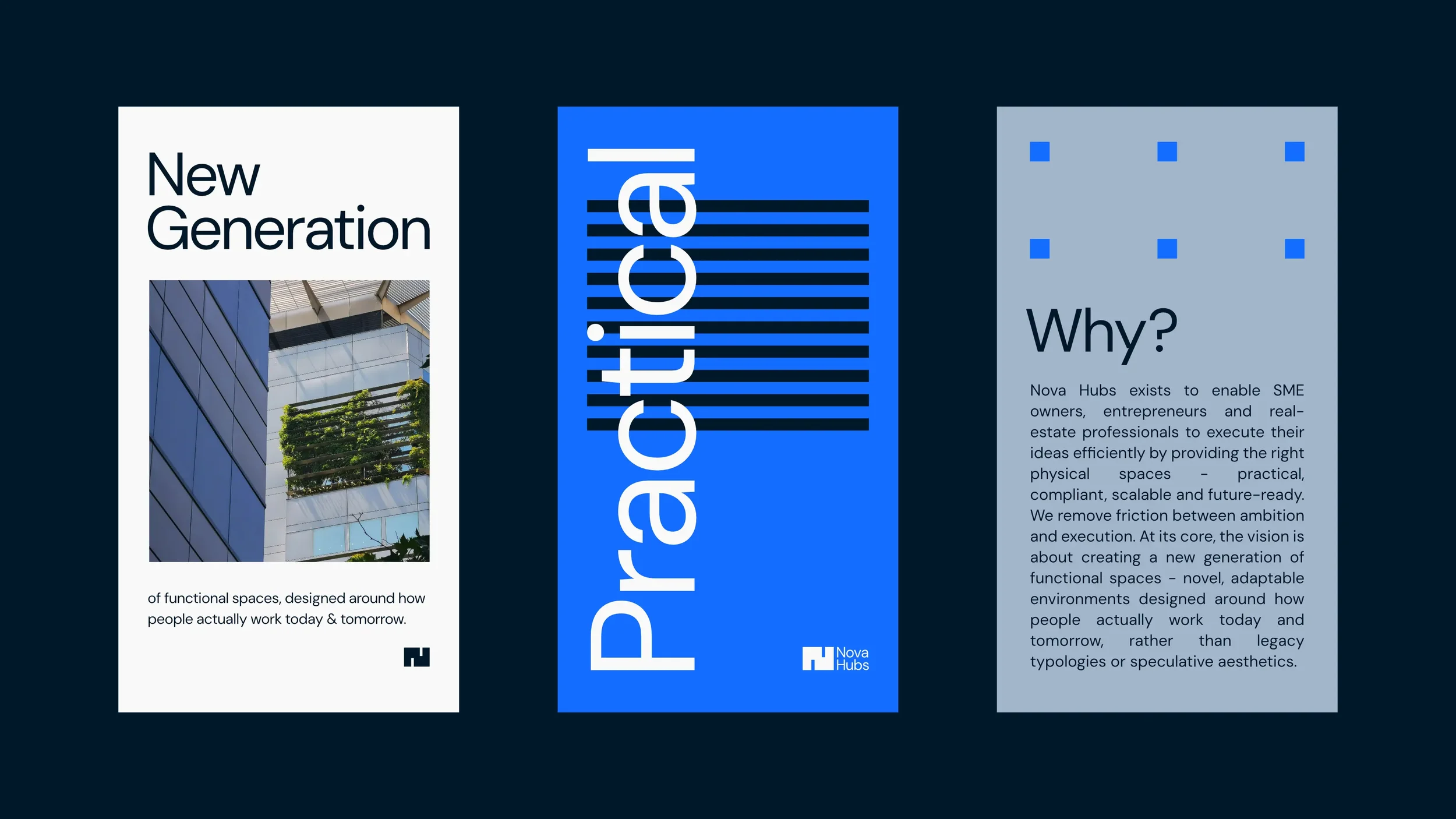
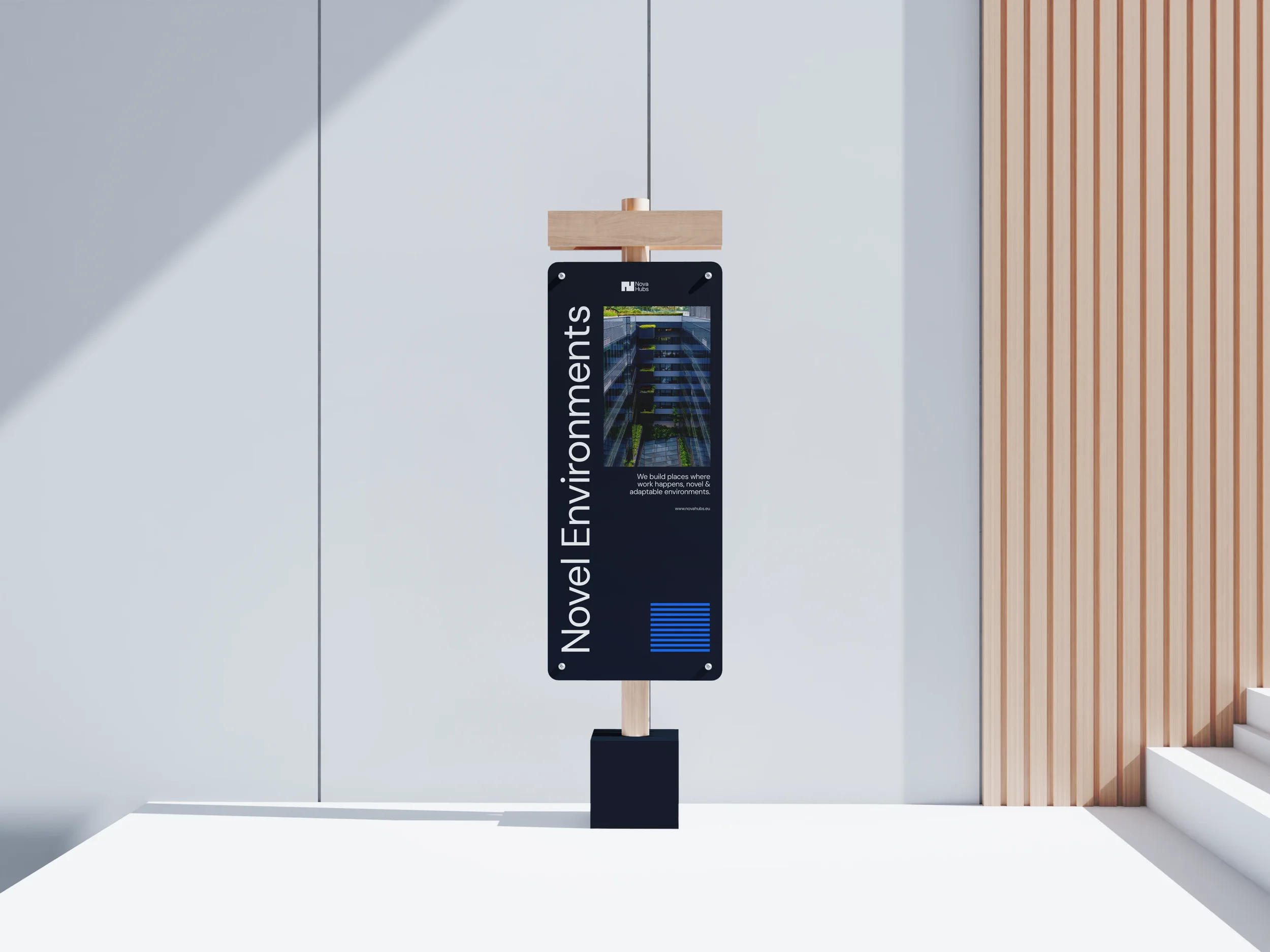
With a so-called modular approach in the logo design, I’ve introduced this approach to all the remaining elements within the Visual Identity. One that makes it very noticeable is the following design for social media & print apparels.
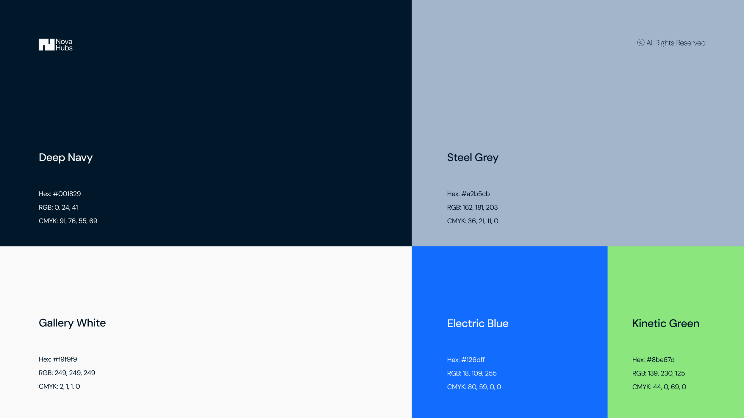
The color palette was a challenging section, given the fact that the real estate industry is overly saturated by a corporate color structure. Thus, we had to get philosophical with colors and give them a sense of ‘‘understandable action’’ across the Visual Identity.

Typography had to speak on its own, based on the modular approach we’ve designed. Typography had to be chosen taking two considerations: the industrial sophistication & the practical nature of the brand. We chose DM Sans as the foundation.
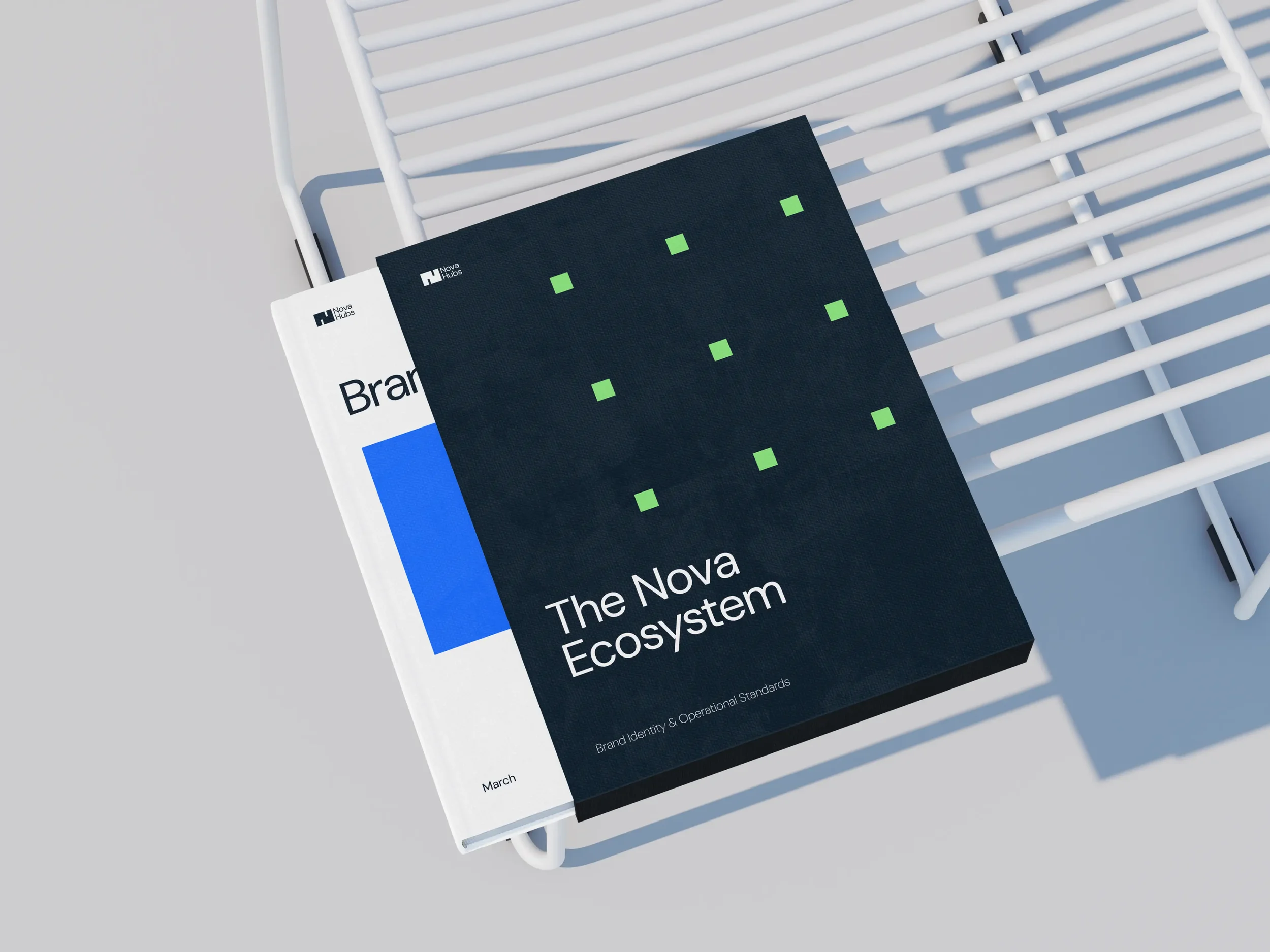
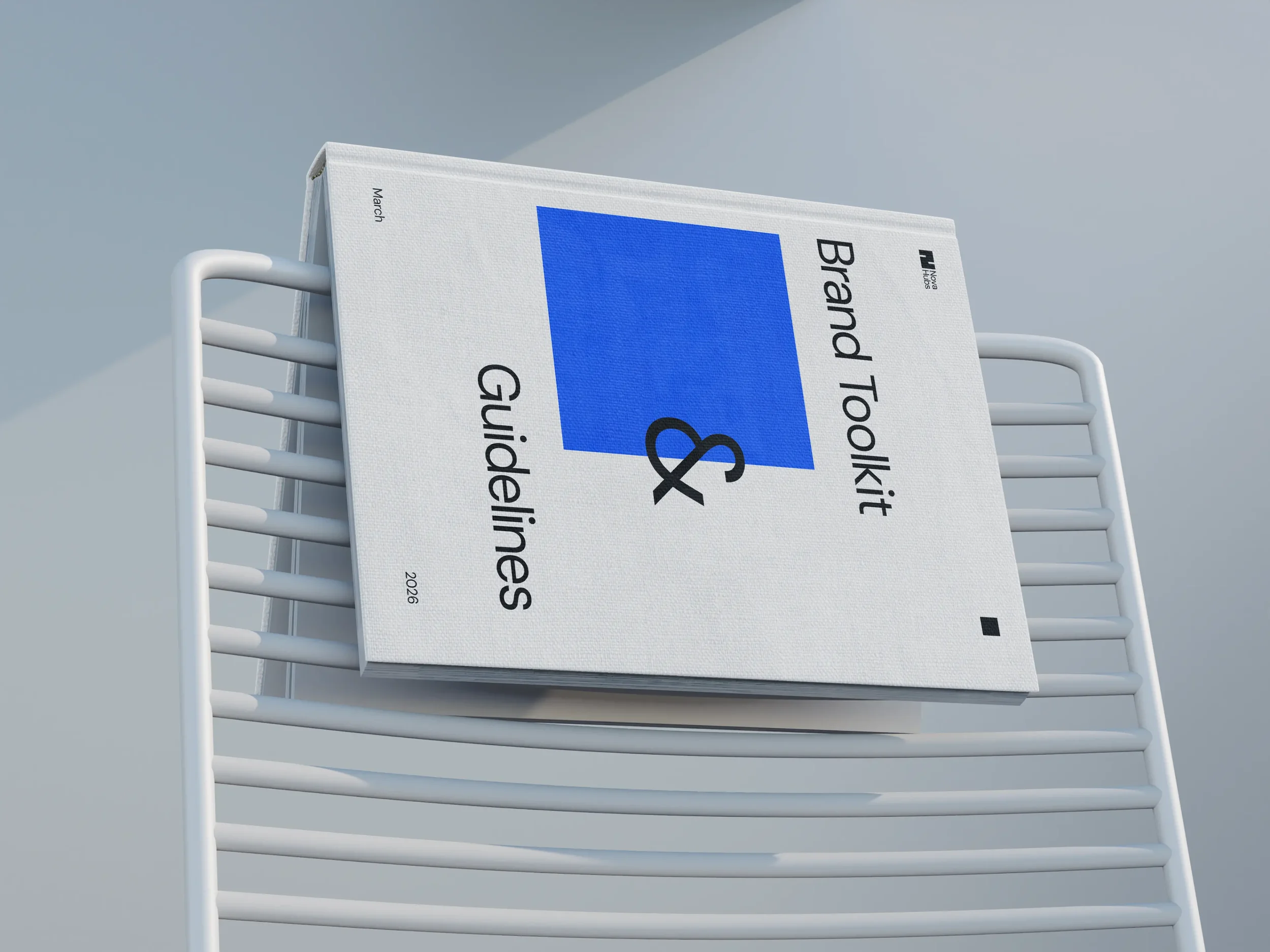
I took the Visual Identity a bit further and animated a set of simple illustrations I’ve made, tied to the Brand Book of Nova Hubs. They represent specific events & actions around the brand’s operational standards.
The whole visual system is built around the logic of something new, novel & modular. In that sense, Nova represents the modular approach of real estate: new, adaptable & future-ready environments organized around space & clarity.