Brand Design: Underbeam
Brand Design: Underbeam
Brand Identity Design: Underbeam
Underbeam is a subscription based agency model, founded in Chicago, Illinois. It represents an agency model in which e-commerce brands get agile support for their development & design endeavors, at a competitive cost. A model similar to Upwork but more oriented towards e-commerce businesses.
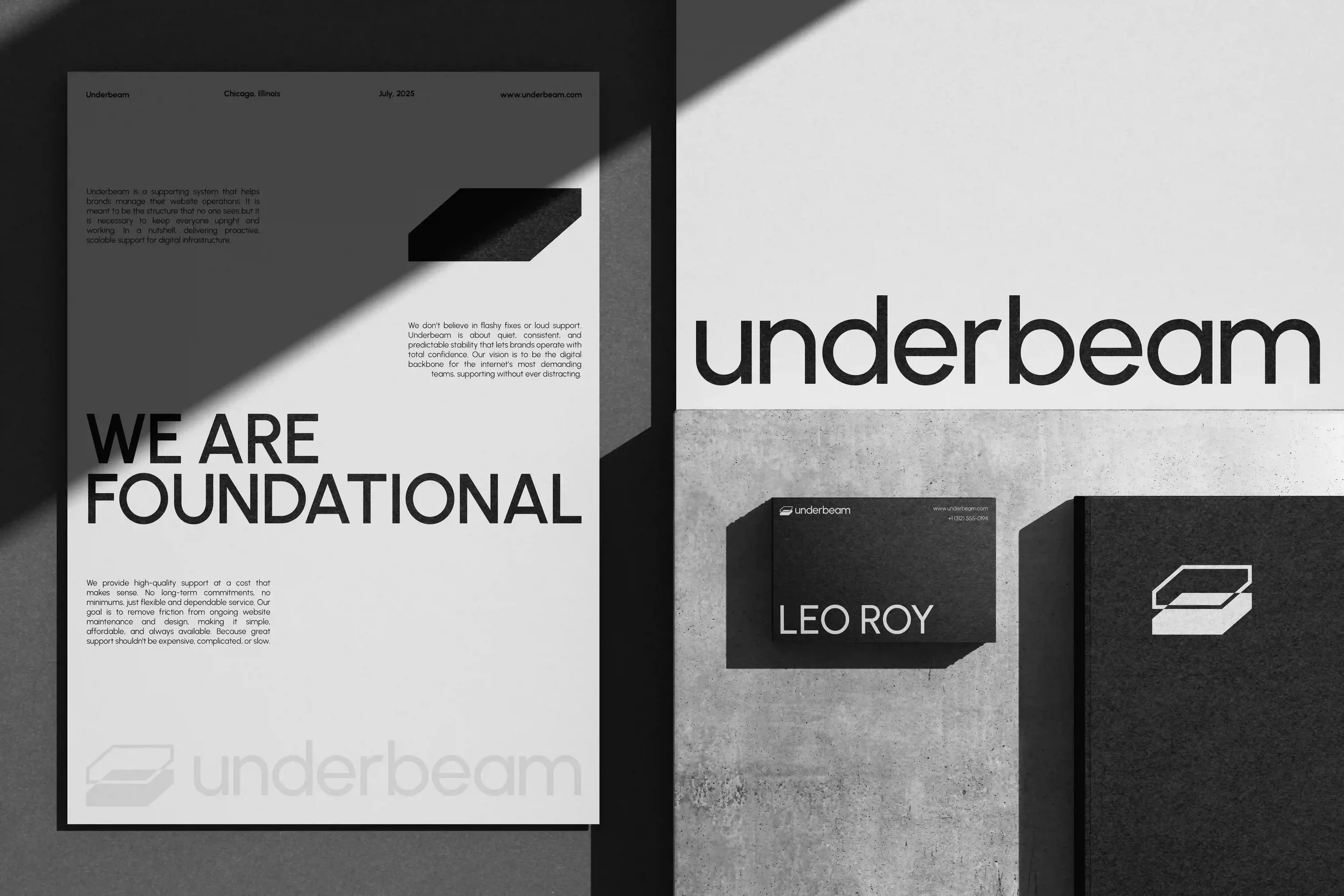
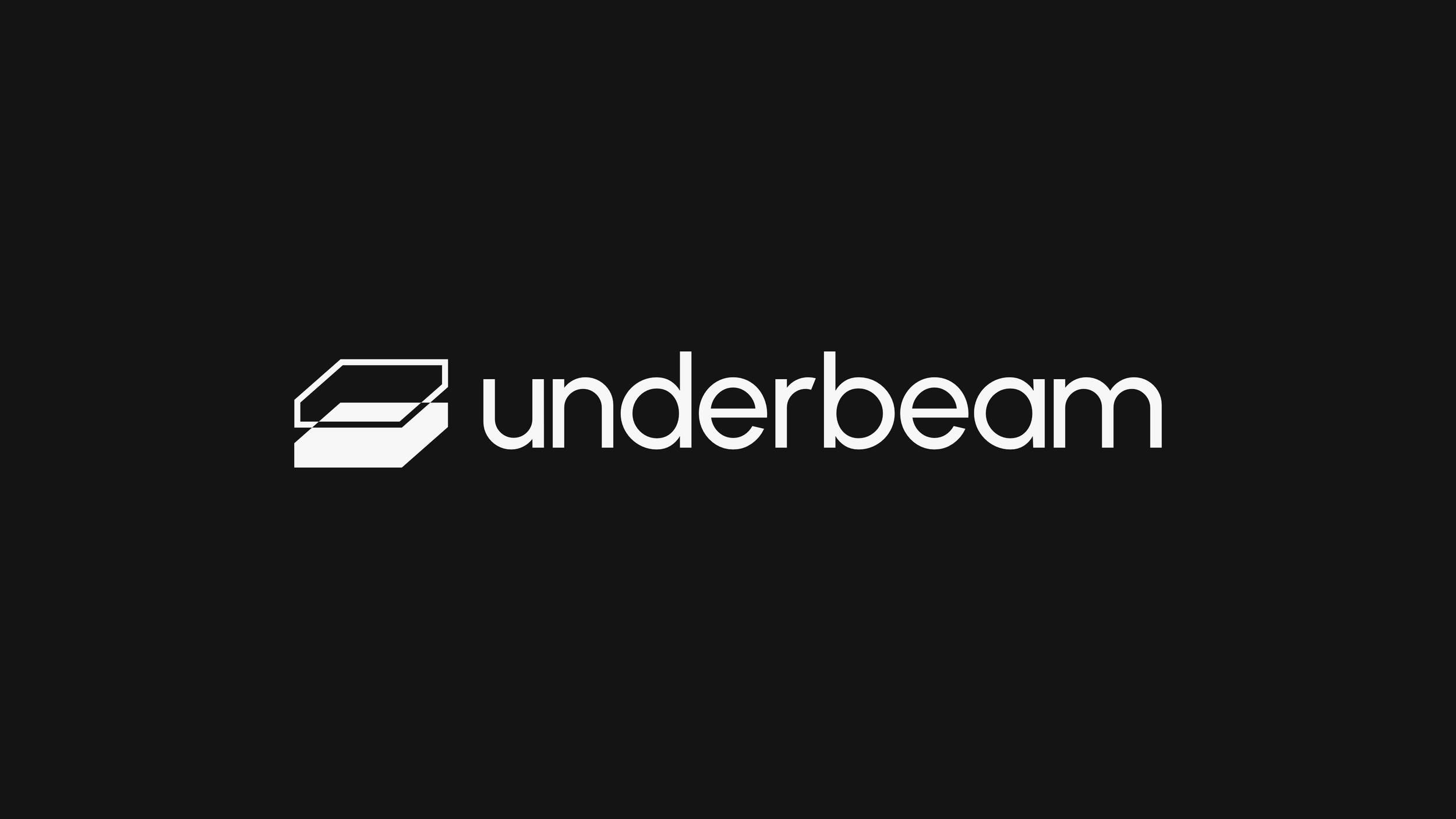
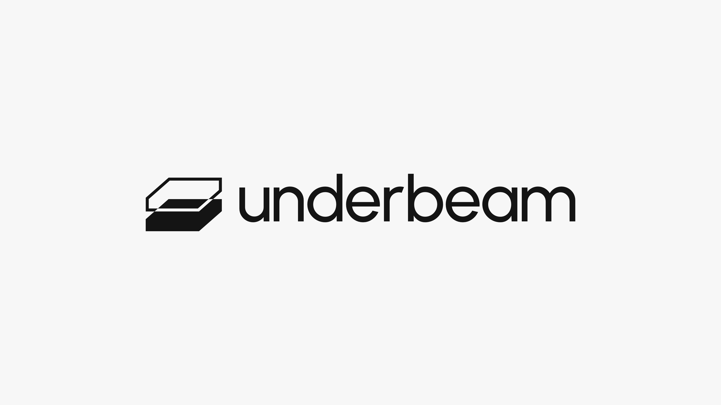
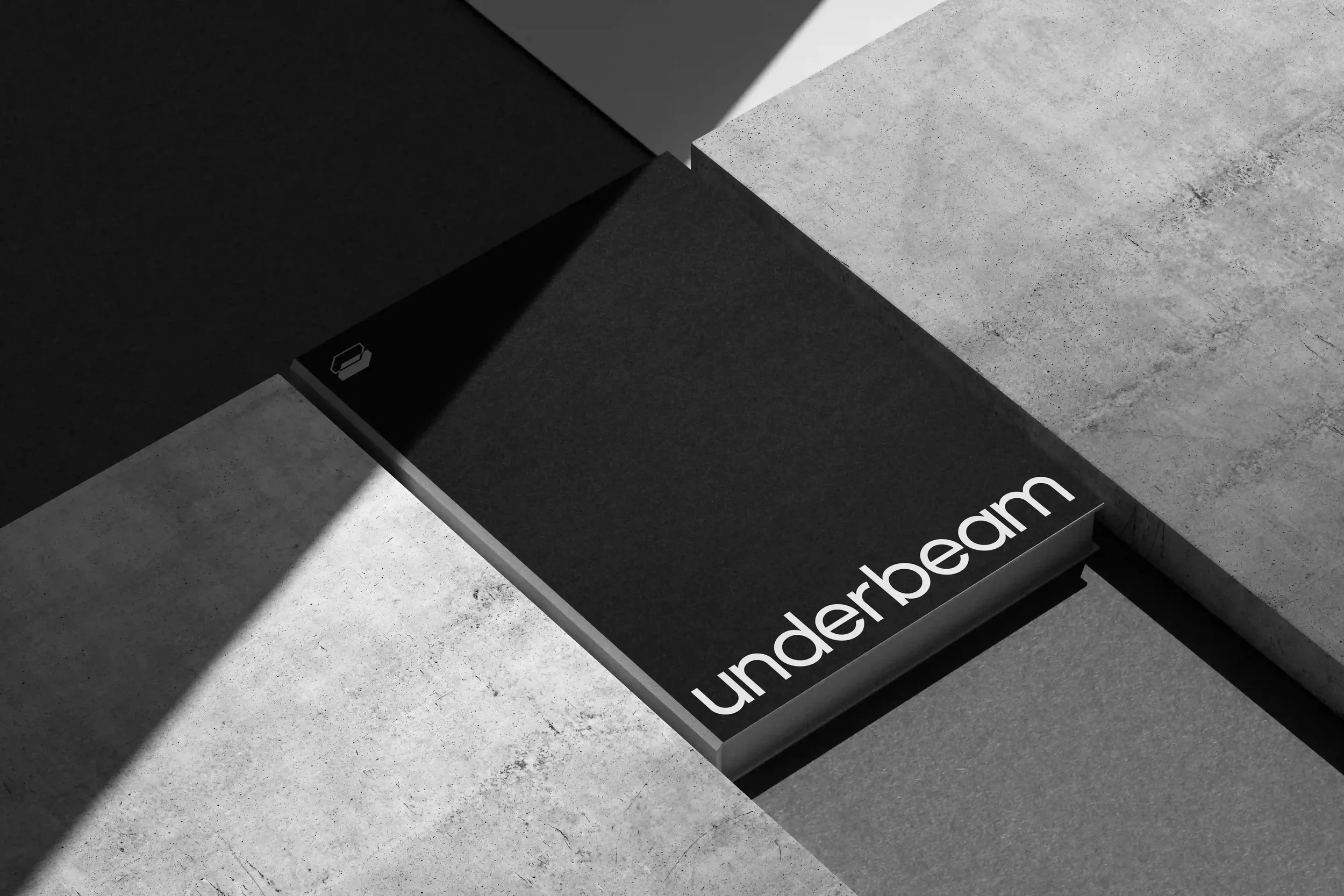
The logo meets form & function. I’ve designed it with a simple concept in mind: the beam as a structure below in an abstract 3D space, holding everything tight together - the outlined stroke above as the invisible work that happens during each project. Combined perfectly with a sans-serif typeface - I’ve achieved a sophisticated look, without compromising on affordability & an approachable feel the brand aims to have.
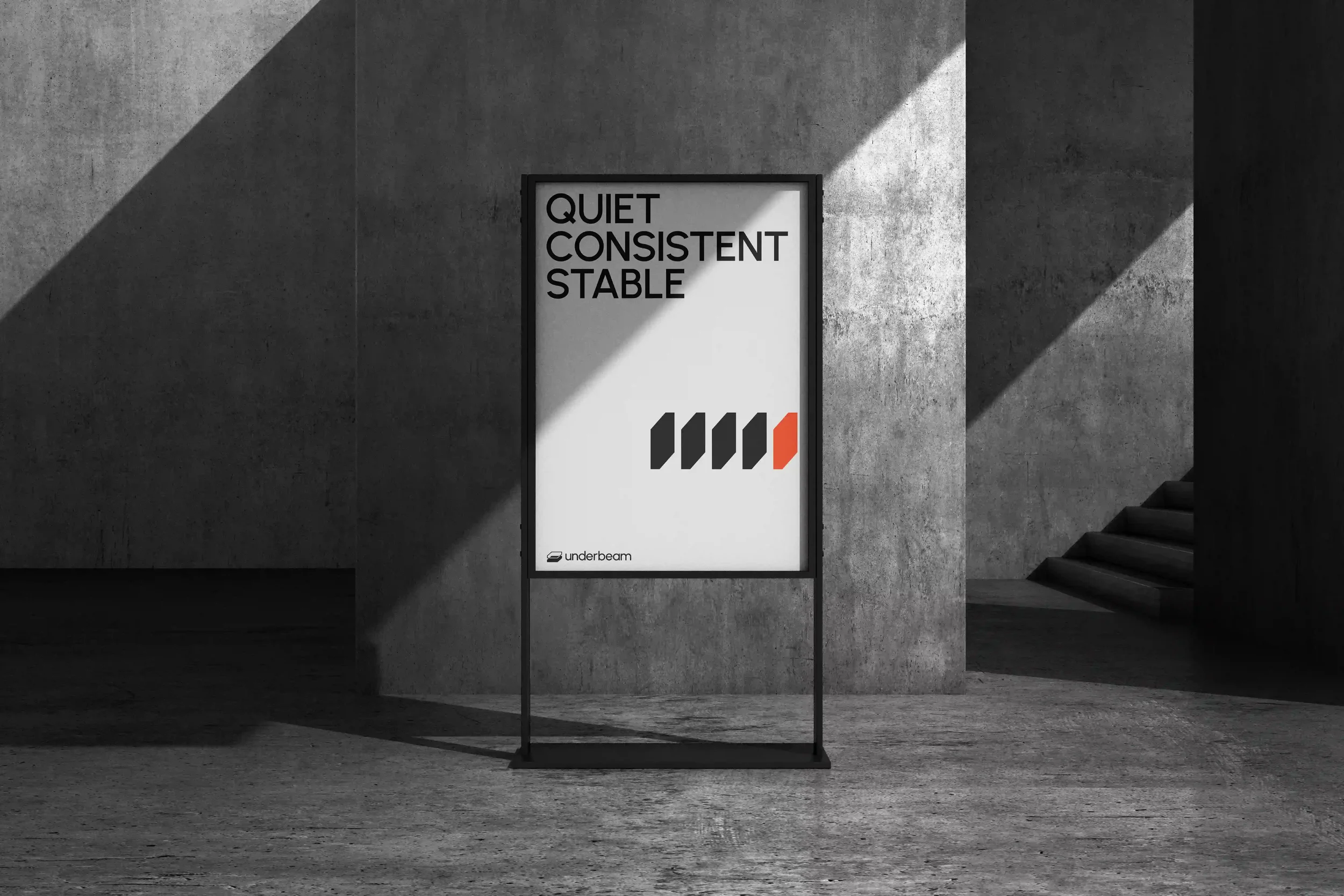
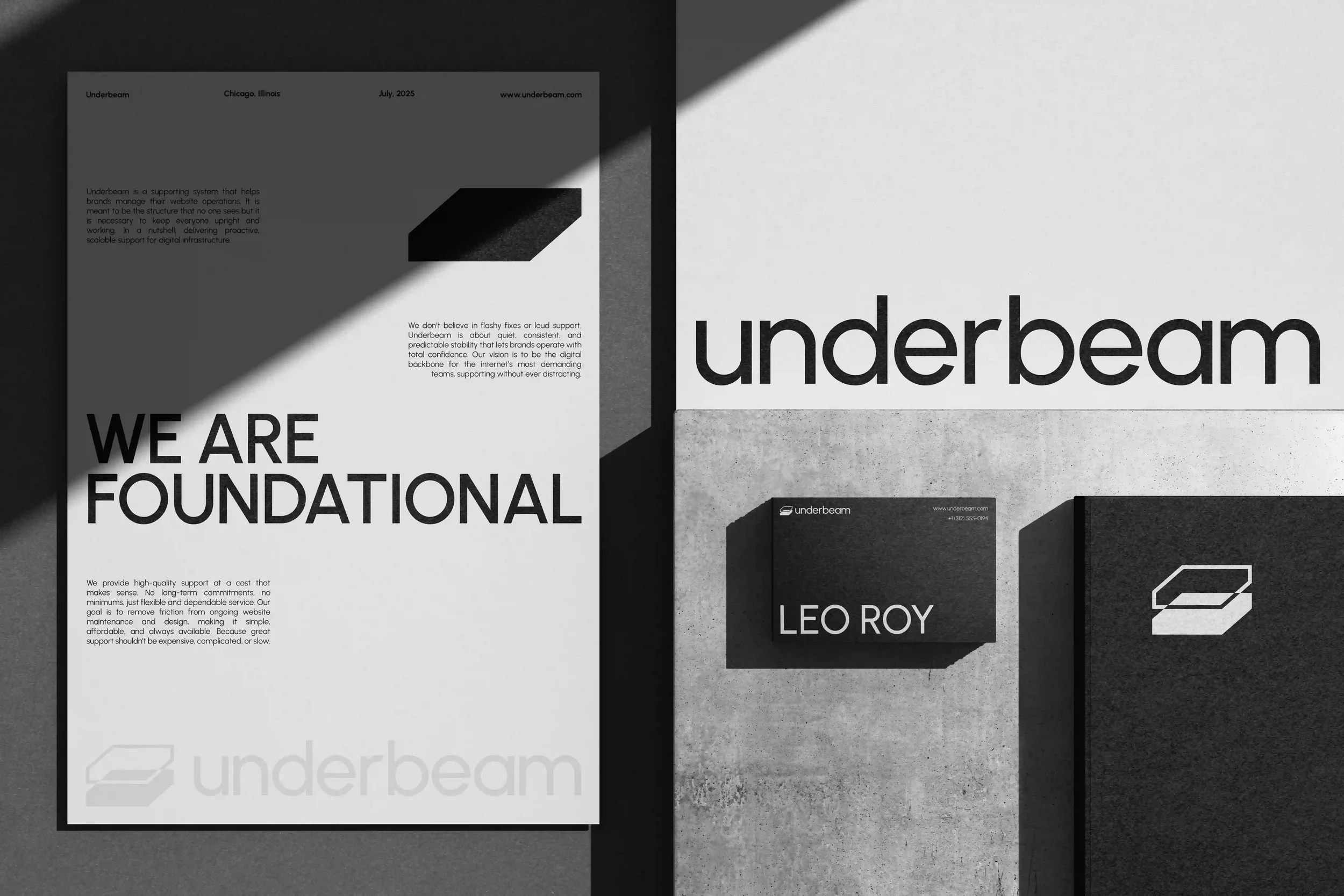
Underbeam positions itself as a foundation, a foundational brand giving brands what they need in a quiet, consistent & predictable manner. Thus, the majority of the brand assets that I’ve designed have a very laid back, quiet & edgy look - reminding visually that a confident team stands behind the process.
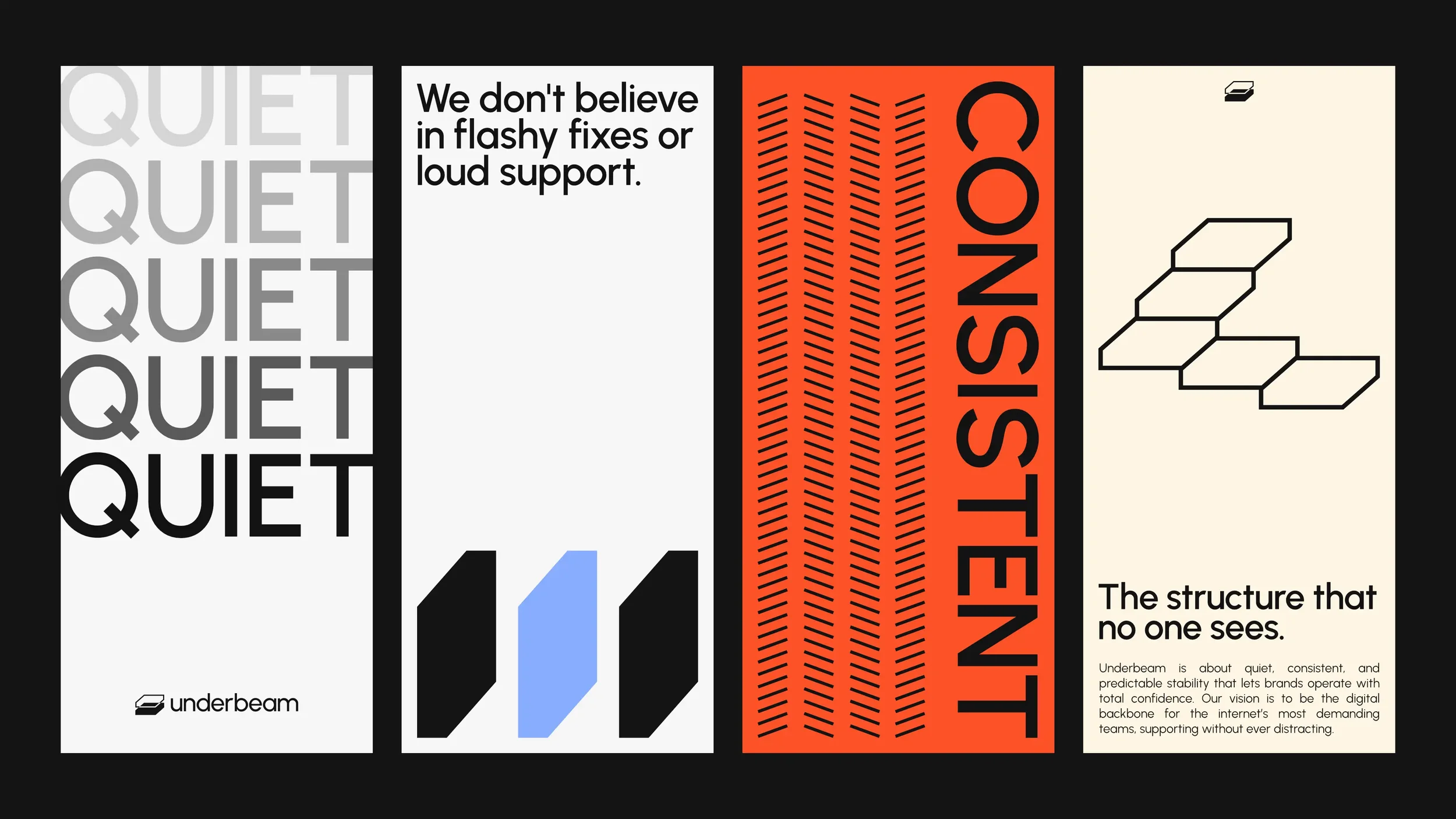
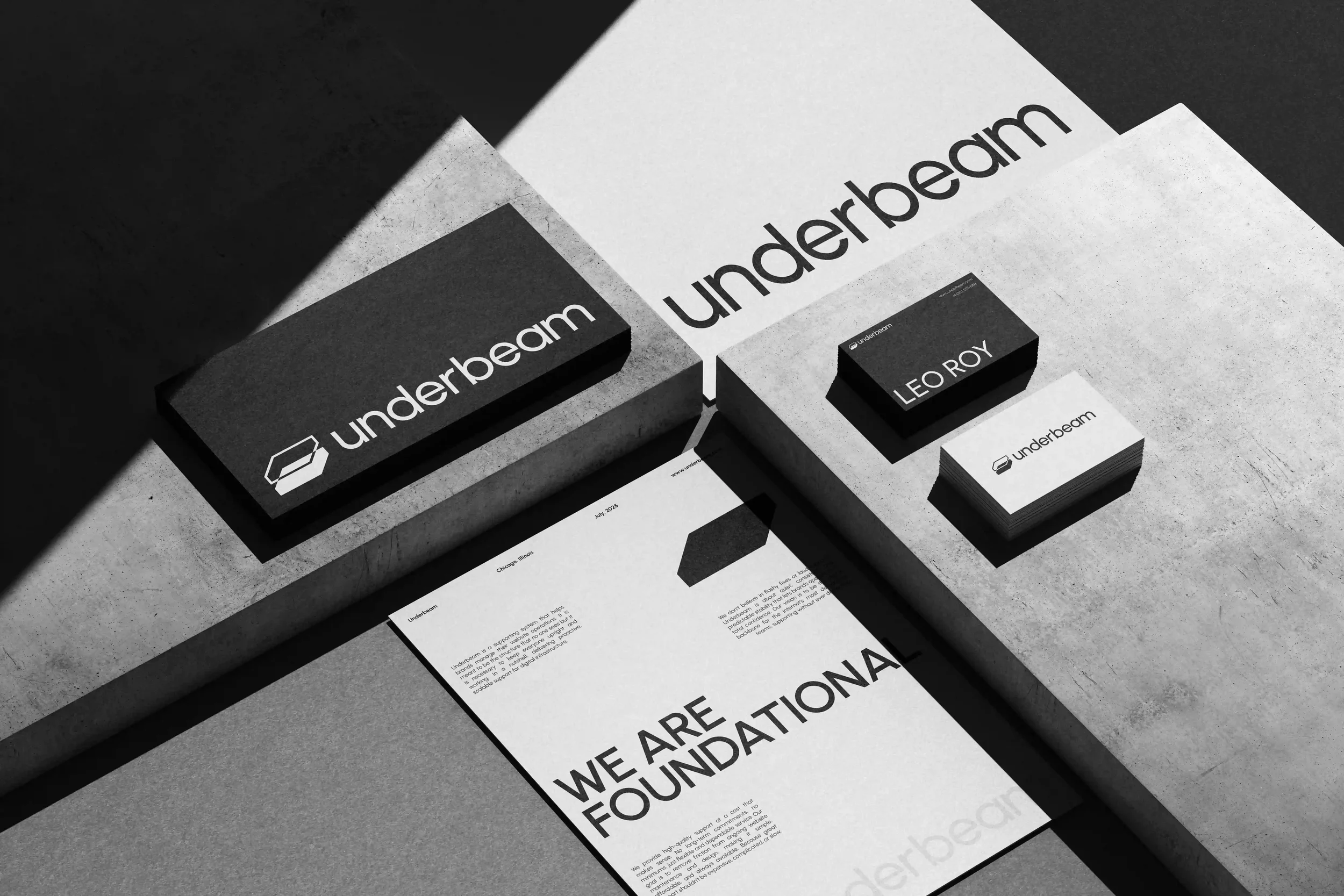
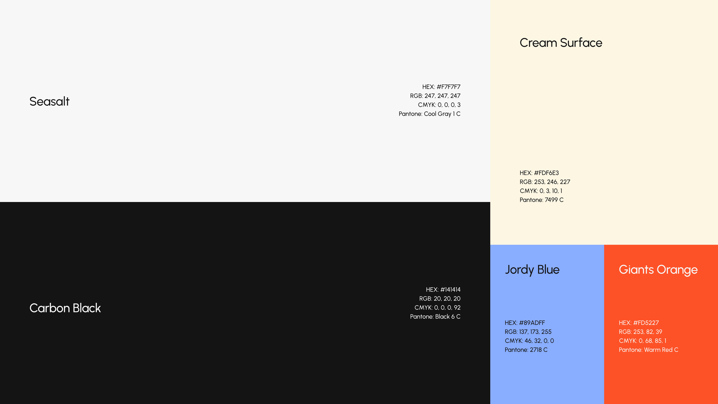
Using carbon black & sea salt as the primary / foundational colors for Underbeam was a no brainer. They are the anchor of the identity & represent the foundation & layout structure of Underbeam. With rest of the colors, I had to get strategic a little bit, targeting a wider audience. Thus, cream surface gets us to the point where it feels invisible but luxurious and has a slight warmth and elegance tone. Jordy blue has its own course of tech-forwardness and slight predictability which is one of the brand’s core principles. Giants orange is a punchy accent that demands attention without overwhelming the brand’s calm, but also - when you mold steel, you have to get it extremely hot, which makes for this type of color. Crazy thought process. :)