NAMING ART DIRECTION BRANDING LOGO DESIGN PACKAGING
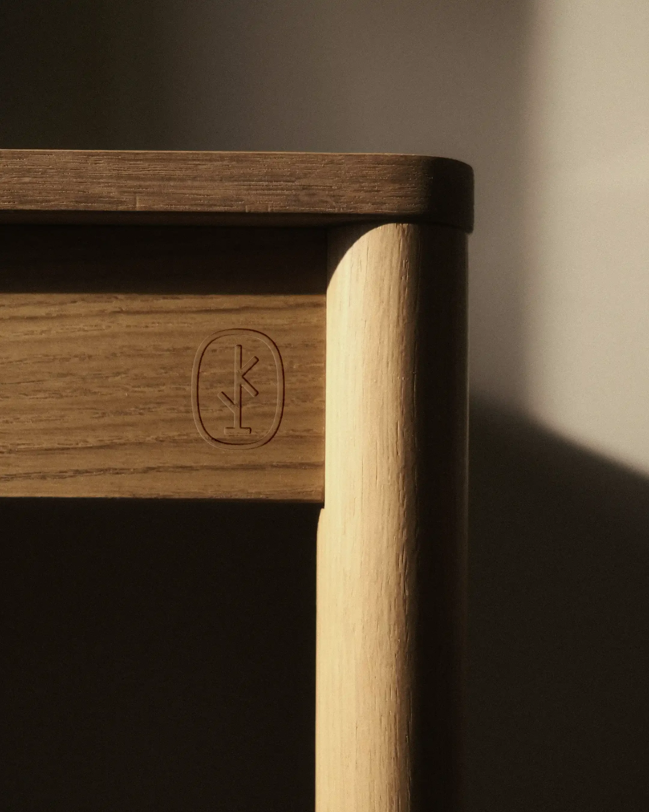
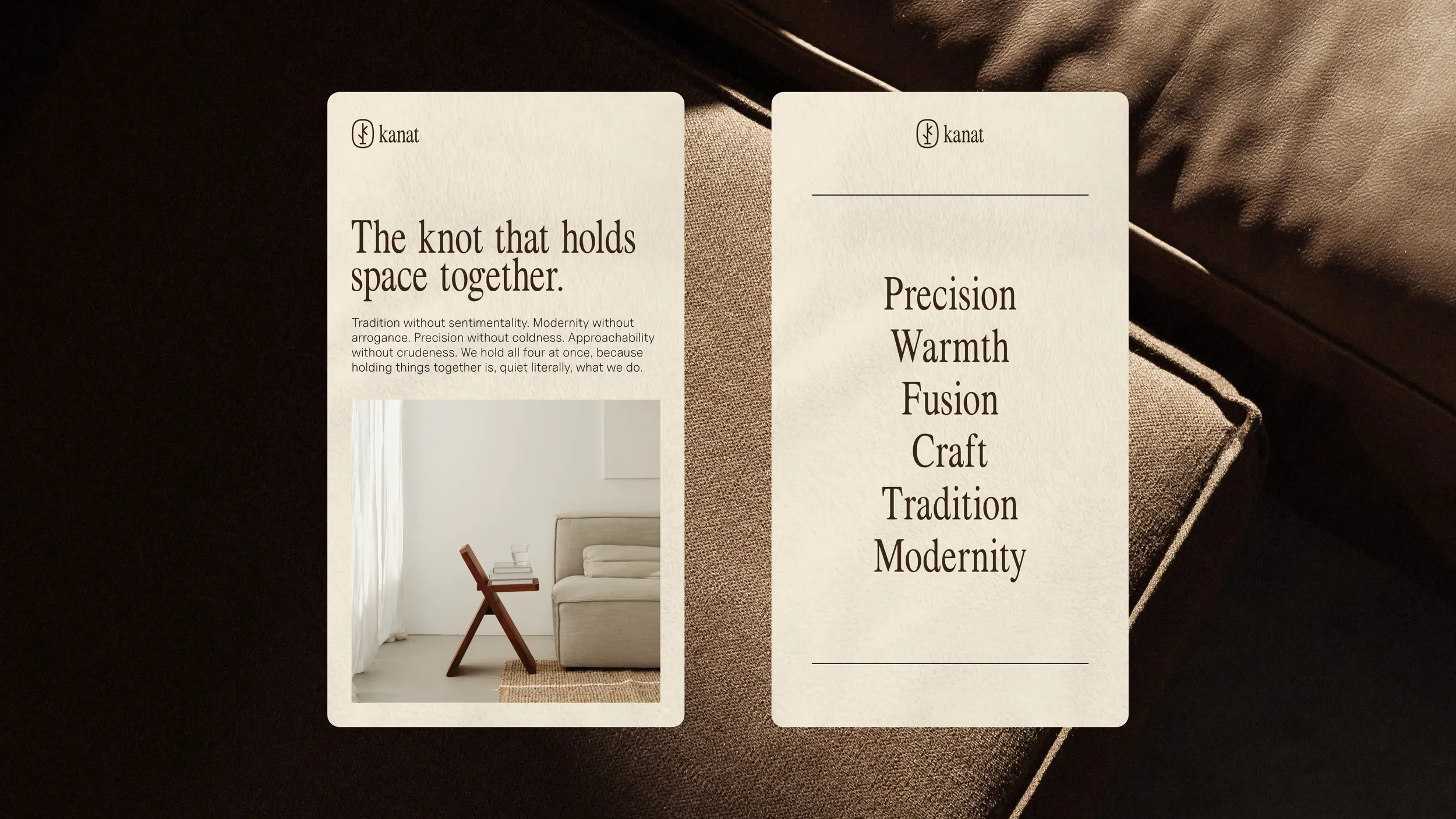
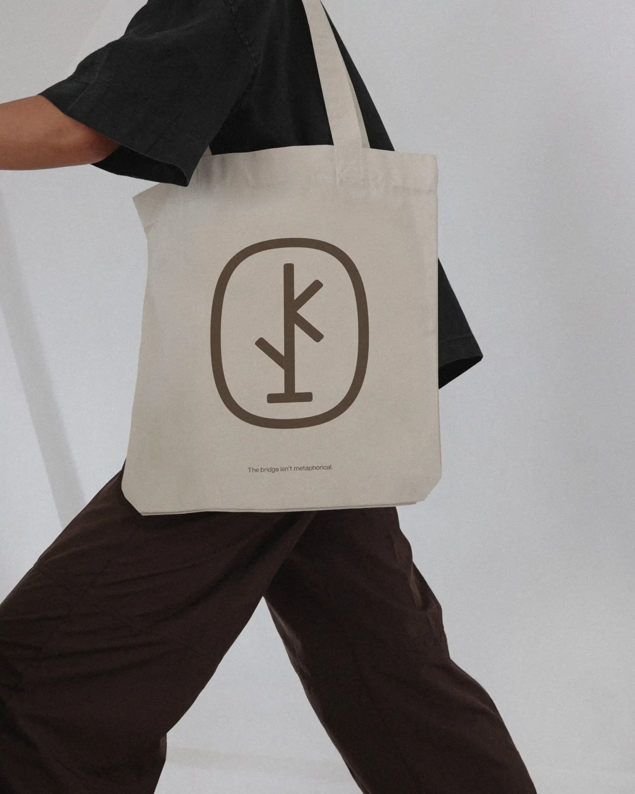
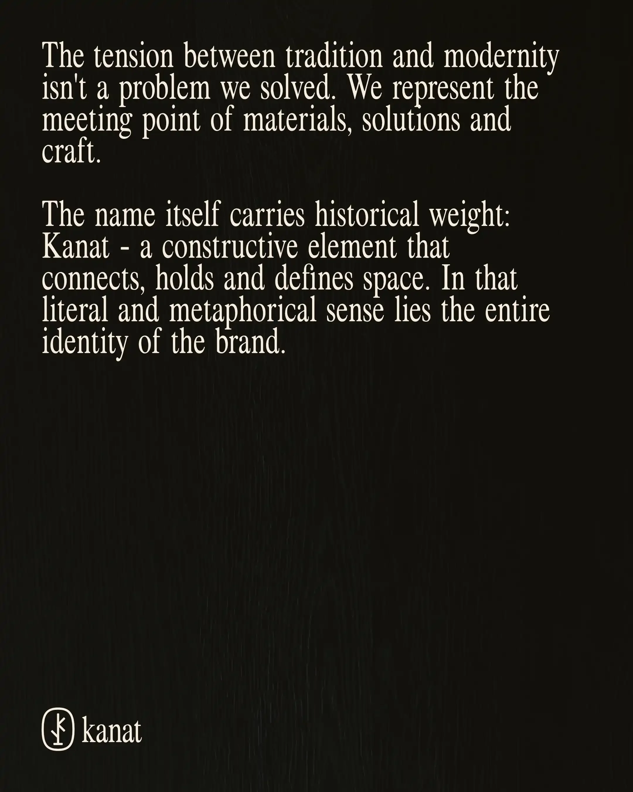
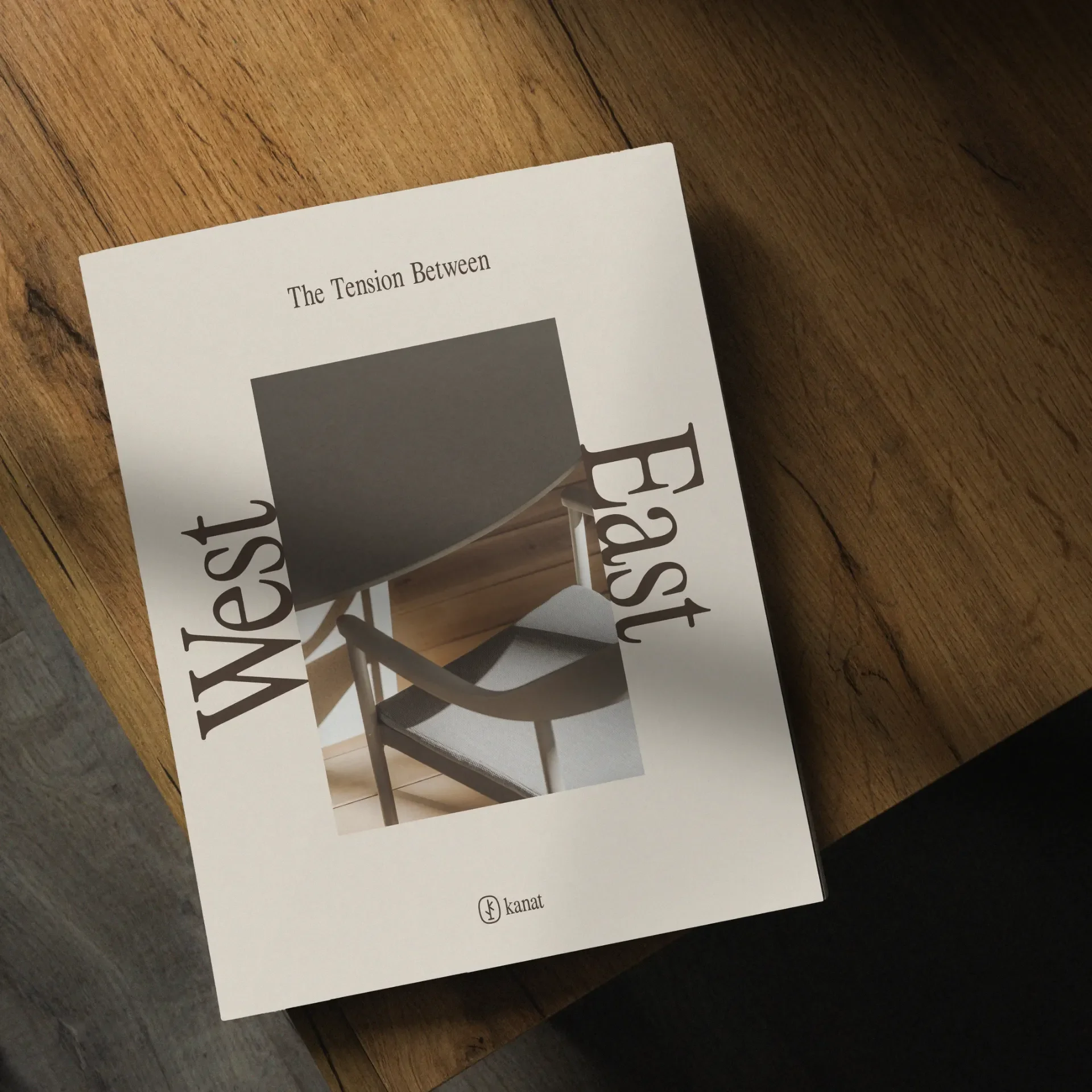
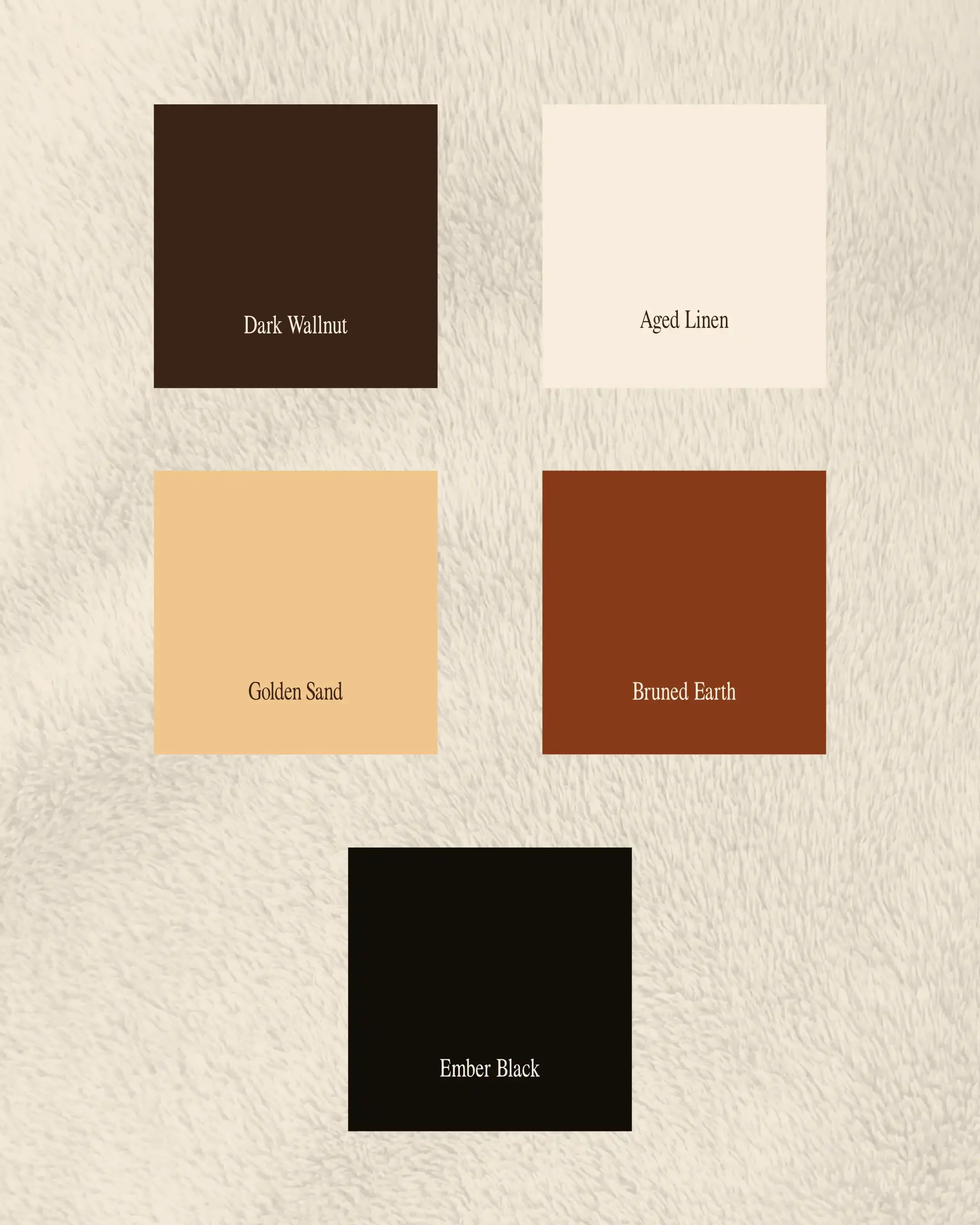
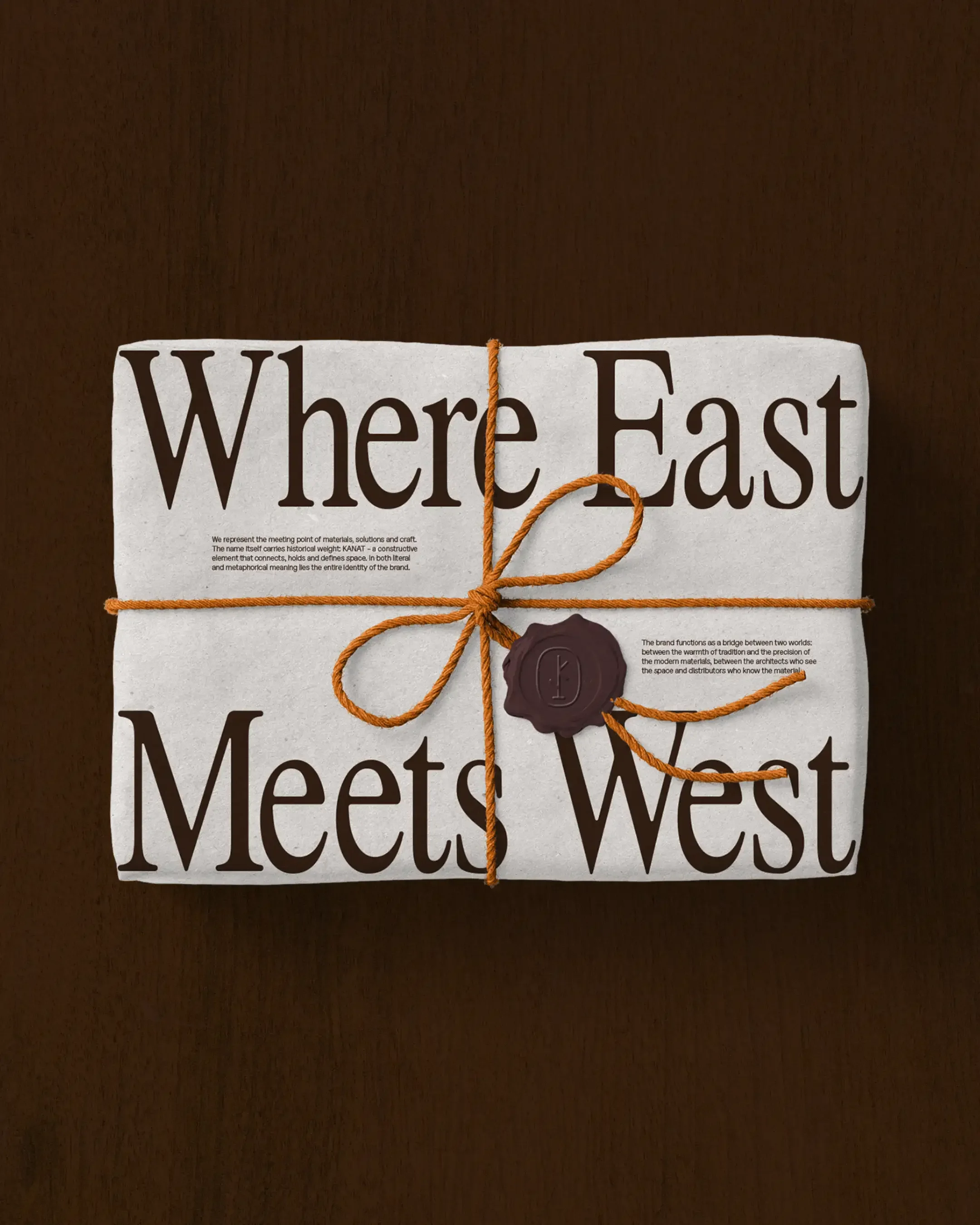
Kanat sits at the intersection between an interior design studio & a raw distributor brand. A niche inside a niche. The complete strategy we developed was based on the idea where East meets West. We came up with a name that has a traditional context - Kanat means the knot that holds old windows. Thus, the logo design represents a circular old window with a mark that has a ‘‘K’’ inside for the initials, as well as an abstract coat holder (avoiding cliches such as chairs or tables). The look of the brand was designed in a form of a constant tension between the East and the West so Kanat brings the materials, but also makes them breathe and functional in the space. I’ve designed the identity that reflects completely the imagination of the Founder - an ornamental brand that understands the architect but also speaks the distributor language.